


- The new look adds character with features including a redrawn logo
- Refreshed packaging champions the brand’s heritage, with a modern twist
- New design set to be on shelves in coming weeks
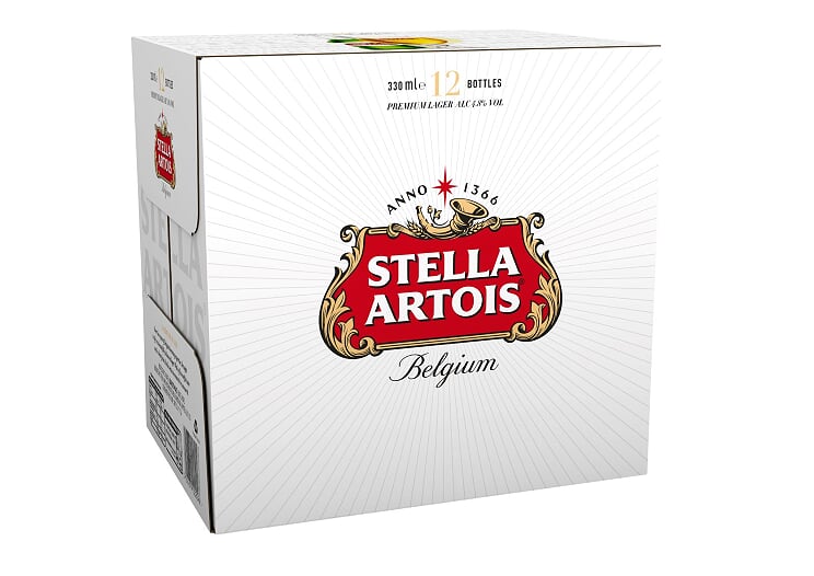
AB InBev today announces the launch of a new packaging design for the UK’s number one selling alcohol brand[1], Stella Artois, appearing on shelves in the coming weeks. The new look is a traditional, yet modern, representation of the Stella Artois brand which aims to champion its proud heritage while still looking forward to the future.
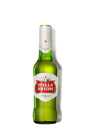 Developed in partnership with global brand design agency Jones Knowles Ritchie, the new packaging includes a redrawn logo – or cartouche – adapted from its original, historic form, which proudly highlights Stella Artois’ namesake, the star, and nods to the brand’s 600 years of Belgian brewing heritage. Alongside the logo, the eight-pointed Stella Artois star continues to be an integral part of the brand persona, emphasised by the new ‘rays’ which draw attention to the emblem. The addition of rays add texture to the cans, bottles and packs, giving them a contemporary feel, while drawing attention to the famous Stella Artois logo and star.
Further refinements include the introduction of subtle typography placed behind hero imagery across packs. Watermarked text, pulled from the Stella Artois archives, will infuse a classic Stella Artois feel with the more modern branding. Each pack will feature the product story which celebrates the history behind Stella Artois’ distinctive taste and underlines its premium credentials. In addition, the brand has brought back an authentic tag line from its past: ‘La Bière Fine de Luxe’ to add a romantic, continental flavour and reinforce Stella Artois’ historical reputation as a premium beer.
The new packaging has been developed with consumer preference in mind. Stella Artois conducted research, which revealed that versus the current pack visuals, the new design drives statistically significant uplifts in perceptions of being modern, sophisticated and having Belgian brewing expertise alongside a statistically significant lift in shelf stand out.
The refreshed design will begin to feature across all Stella Artois packs in the coming weeks and on Stella Artois 4% later in the year.
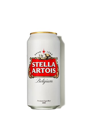 In addition to the new design, there are structural changes to the packaging. Bottled beer is an increasingly popular format among consumers, with forty-three per cent of UK beer drinkers only drinking bottled beer. To enhance the experience, Stella Artois has added a second perforation to the neck label of bottles. Denoted by an easy to tear gold tab, this second perforation ensures that the paper wrapping never touches the lips and doesn’t get in the way of the beer’s great taste. Cans are also receiving an enhancement with a matte finish being added from early 2019 next year, giving them a premium feel alongside the new visual identity.
Alexis Berger, Marketing Director for Stella Artois Europe, commented, “Design is absolutely integral for any brand and as a brewer with 600 years’ heritage we do not take redesigns lightly. We are incredibly proud of the new direction the brand aesthetic is taking, highlighting our Belgian heritage but also modernising Stella Artois to lead consumers’ expectations of premium. We’re confident this refreshed design will stand out on shelves and highlight the qualities of Stella Artois which make us the UK’s favourite alcohol brand.”
[1] Stella Artois is the number one selling beer brand by volume and value in the UK. Source: Nielsen, Value Sales, YTD Data to 20.05.2017

Comments are closed.