


London design company Carter Wong has completed the rebranding of an iconic ice cream product – the Cornetto. Created some fifty years ago, the brand is shaking off its roots as a seasonal, out of home treat to sit alongside snacks as something to enjoy at home and share any time of the year. The rebrand gives the product a more youthful appeal, aimed at a 14-25 year old market. The visual changes signal and support a range of innovations in the product and product range that will reposition the brand worldwide.
The new brand design addresses key issues related to the global reach of the brand. It takes into account language differences, the variable printing capabilities of countries, and most importantly brand recognition. While not rigidly uniform, the new look signals that wherever you are in the world, the Cornetto range is part of a single family. The message across the globe is that the new-style Cornetto provides a full on journey of tastes and textures from crown to tip, with six deeper flutes on the crown and the all-important chocolate tip at the end. A slightly suggestive strap-line, ‘Enjoy the ride, love the ending’ aimed at a more youthful audience supports much of the design.
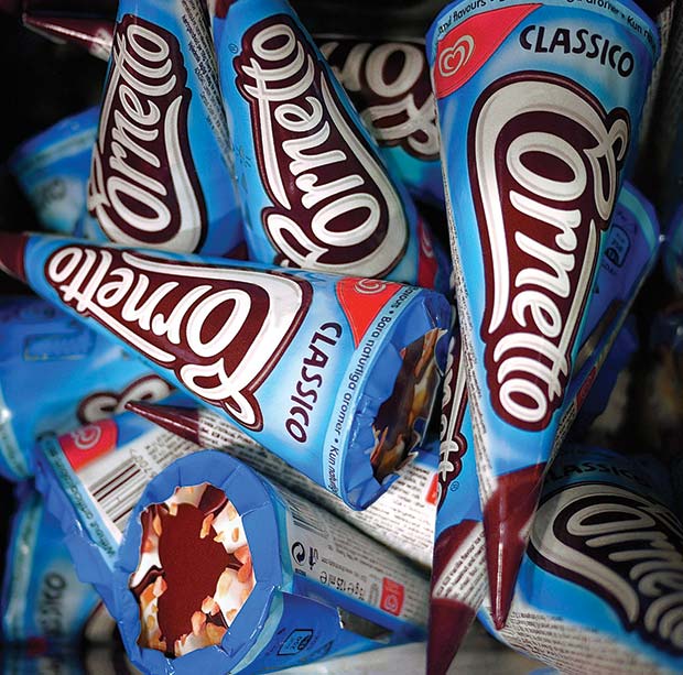
The visual changes begin with a complete re-design of the Cornetto logo. In its new guise, hand-drawn free-flowing letters reference the swirl of the iconic Unilever Heartmarque, also designed by Carter Wong and recognised the world over. The shaping of the logotype playfully mimics the shape of the cone, with a large ‘C’ at the top end, tailing off to the ‘tto’ at the tip. This makes the logotype more playful and less ‘corporate’. The new logotype ‘owns the cone’ as it would on a chocolate bar, to become the main graphic element and primary interface with consumers. The easy-to-recognise graphic nature of the word mark avoids language issues, much like the ubiquitous Coca-Cola logo. The Unilever Heartmarque appears white on red in a curved ‘swoosh’ on every pack.
New colour coding of the Classic single cone and multi-cone packaging give a visual indication of the flavours. The packaging colours draw on familiar universal conventions: blue for Classic Vanilla, red for Strawberry, brown for Chocolate, green for Mint and so-on. The colours are linked to precise pantone references to achieve consistency in every market despite local production. Classic multi-packs have also been given a make-over. Again, these are colour-coded, with appetising images of the cones, ingredients offset against a swirl background. The cones within the multi-packs are given a completely different graphic design based on lively, modern typography intended to discourage the sale of the cones as individual units. Some regional differences have been introduced, without undermining the ‘family’ look, to reflect local market tastes.
The re-design is carried across the premium Enigma range, which signals their different recipes with the aid of clear perspex coned lids that reveal an enticing peak of ice cream at the top and chocolate swirl patterns interwoven with their flavour colour coding.
As part of the range review, innovative Mix-Mini packs have been introduced to encourage the concept of sharing, in response to the tendency for the 14-25 age group to snack while they are involved in largely technology-based group activities.
To appeal to the younger target audience, Carter Wong has created a library of quirky illustrations that add a sense of fun and bring to life important messaging. These mood icons include playful characters, thought bubbles, love hearts and arrows, as well as references to universal youth culture: surfer vans, a play on the I ? NY logo [I ? ?] and a couple on an Italian Vespa scooter, for instance. Similarly, a bespoke hand-drawn font in all languages has also been designed as part of the new design collateral.
To support the new branding and packaging, Carter Wong has created guidelines for point of sale collateral to inspire local design and sales teams the world over. These are encouraged to take their own initiatives in their markets and convey the spirit rather than the letter of the branding through their marketing collateral. They can also choose or draw inspiration from a menu of ready designed elements, which include fun cone-shaped A boards, youthful wind-surf style banners, eye-catching waste-paper bins and freezer décor, and more.
Global Vice President Ice Cream Cornetto & Kids, Alberto Di Leo commented “Carter Wong always employ a great deal of craftsmanship and art in what they do which is at the very heart of Unilever’s Marketing Strategy, ‘Crafting Brands for Life.’ With the new Cornetto logo they have created something truly magical and unique. Bravi!!”
Carter Wong’s Creative Director Phil Carter comments on the brand design programme saying: ‘Second only to the Unilever Heartmarque, the Cornetto is probably the most recognisable ice-cream brand across the world. The commission to redesign and reposition it has been a privilege. Our intimate knowledge of Unilever’s ice cream business and its global/local position gave us invaluable insights into how best to progress the Cornetto re-brand and create something memorable.’
CARTER WONG design Ltd
Tel: 020 7569 0000
Email: info@carterwongdesign.com

Comments are closed.